<!DOCTYPE html>
<html>
<head>
<meta charset="utf-8">
<title>rwd</title>
<style>
*{padding: 0; margin: 0;}
#wrap{
width: 90%;
border: 4px solid black;
margin-right: auto;
margin-left: auto;
}
#wrap div{
display: inline-block;
width: 100%;
height: 100px;
}
#wrap div:first-child{background-color: aqua;}
#wrap div:nth-child(2){background-color: greenyellow;}
#wrap div:nth-child(3){background-color: orange;}
#wrap div:nth-child(4){background-color: violet;}
#wrap div:last-child{background-color: yellow;}
/* media 쿼리 적용 */
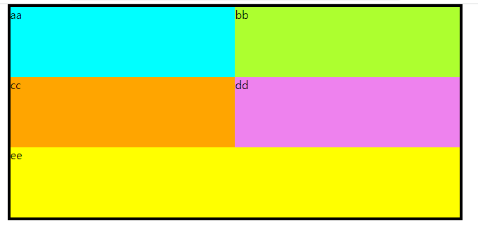
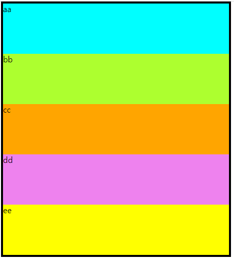
@media screen and (min-width:320px) {
#wrap div {width: 100%;}
}
@media all and (min-width:600px){
#wrap div {width:50%}
#wrap div:last-child{width: 100%;}
}
@media all and (min-width: 800px){
#wrap div {width:20%}
#wrap div:last-child{width: 20%;}
}
</style>
</head>
<body>
<div id="wrap">
<!-- 엔터하면 50,50하면 차지못함 -->
<div>aa</div><div>bb</div><div>cc</div><div>dd</div><div>ee</div>
</div>
</body>
</html>
*{margin: 0; padding: 0;}
ul{list-style: none;}
a{text-decoration: none;}
header{
width: 100%;
background-color: #2d3a4b;
position: relative;
}
#logo{
padding-top: 30px;
padding-left: 30px;
}
#top_menu{
position: absolute;
right: 10px;
top: 20px;
color: white;
font-size: 14px;
}
#top_menu a{
color: white;
}
nav{
border-top: 1px solid white;
margin-top: 10px;
border-bottom: 1px solid white;
}
nav li{
line-height: 3em;
border-bottom: 1px solid #223344;
}
nav li a{
color: white;
display: block;
text-align: center;
}
nav li a:hover{
background-color: white;
color: black;
}
#content #main img{width: 100%; border: 1px solid gray;}
#content #banner li{
border-bottom: 1px solid gray;
}
footer{
padding: 0px 10px;
}
footer img{
width: 100%;
}
*{ margin: 0; padding: 0;}
ul{list-style: none;}
a{text-decoration: none;}
header{
width: 800px;
height: 95px;
background-color: #2d3a4b;
/* header 안의 요소들을 absolute배치 / 자식들의 기준점을 부모요소롤 주기위해 .. */
position: relative;
}
header #logo{
position: absolute;
top: 30px;
left: 30px;
}
header #top menu{
position: absolute;
top: 20px;
right: 10px;
color: white;
font-size: 12px;
}
header #top menu a{color: white;}
header nav{
position: absolute;
bottom: 10px;
left: 220px;
font-size: 16px;
}
header nav li {
display: inline;
margin-left: 30px;
}
header nav li a{color: white;}
#content #banner li {
display: inline;
margin-left: 50px;
}
footer{
width: 800px;
height: 90px;
margin-top: 20px;
background-color: #f1f1f1;
}
footer img{ margin: 10px 0 0 60px;}
#page{width: 820px; margin-left: auto; margin-right: auto;}

'CSS' 카테고리의 다른 글
| CSS-D06 (0) | 2023.10.31 |
|---|---|
| Web App: 반응형웹03 (0) | 2023.10.30 |
| Web App: 반응형웹01 (0) | 2023.10.30 |
| 웹사이트 만들어보기 (0) | 2023.10.30 |
| CSS-D5 (0) | 2023.10.30 |